
G·LEM upgrade of product page
MY ROLE
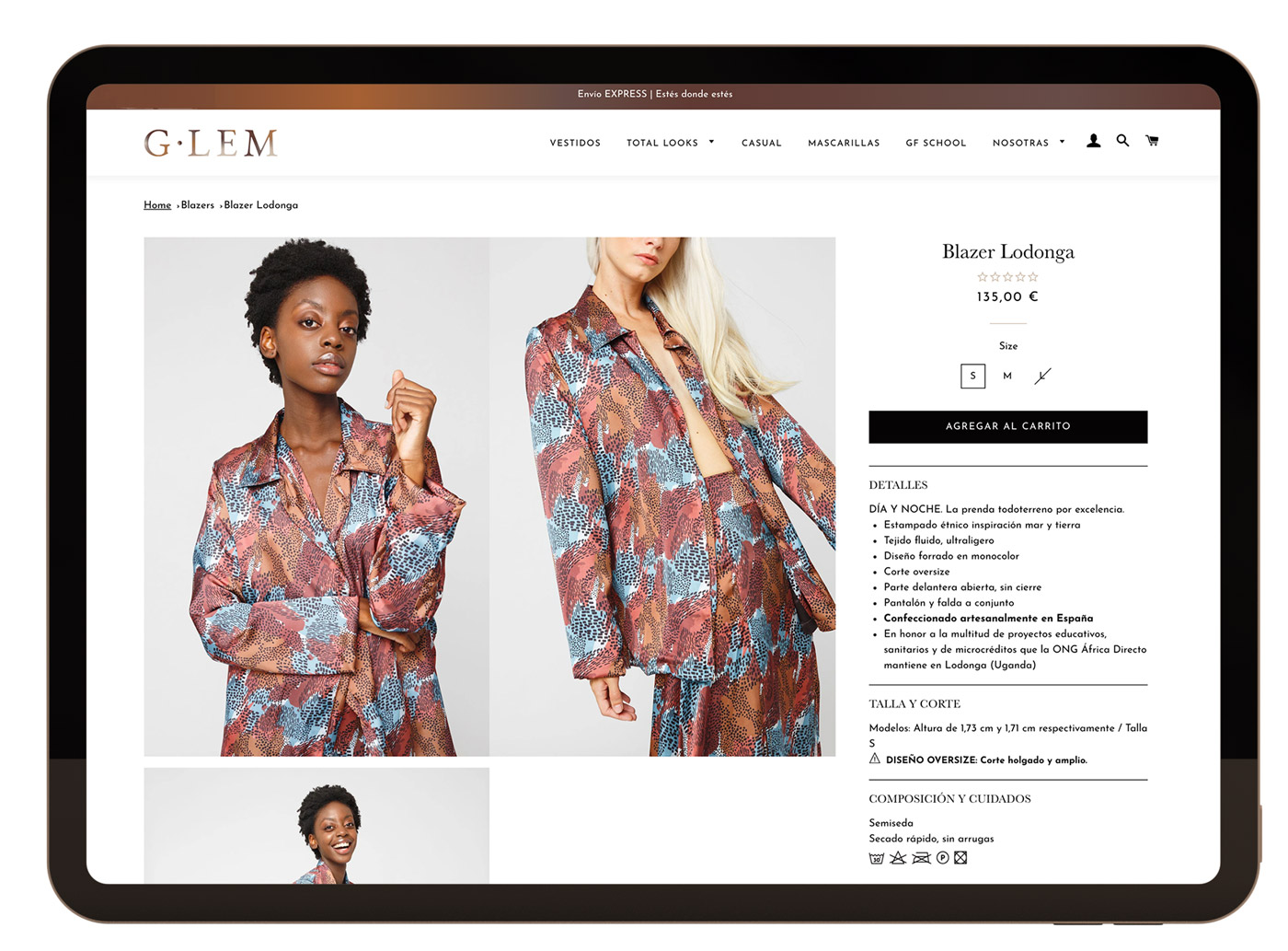
As a G·LEM digital product designer, the initial phase of the product was based on building an MVP that was effective and served to launch and test the product. In this way, design and image were always indisputable factors throughout the project, but there were improvements that were decided to be postponed at the initial launch. In this sense, the initial product sheet emphasized product images, so the idea of using thumbnails was rejected. The purpose was that with just look and without clicking, all images can be seen on desktop and laptop only by scrolling. On mobile the design of the pictures is resolved with a swipe carousel.
RESEARCH & ANALYSIS
The product sheet was very basic, so it was necessary to analyze what type of improvement would improve the average time on page as well as increase the number of sales. Through analytics and especially using Hotjar, it was possible to analyze real navigation from users and how they interacted with the page.
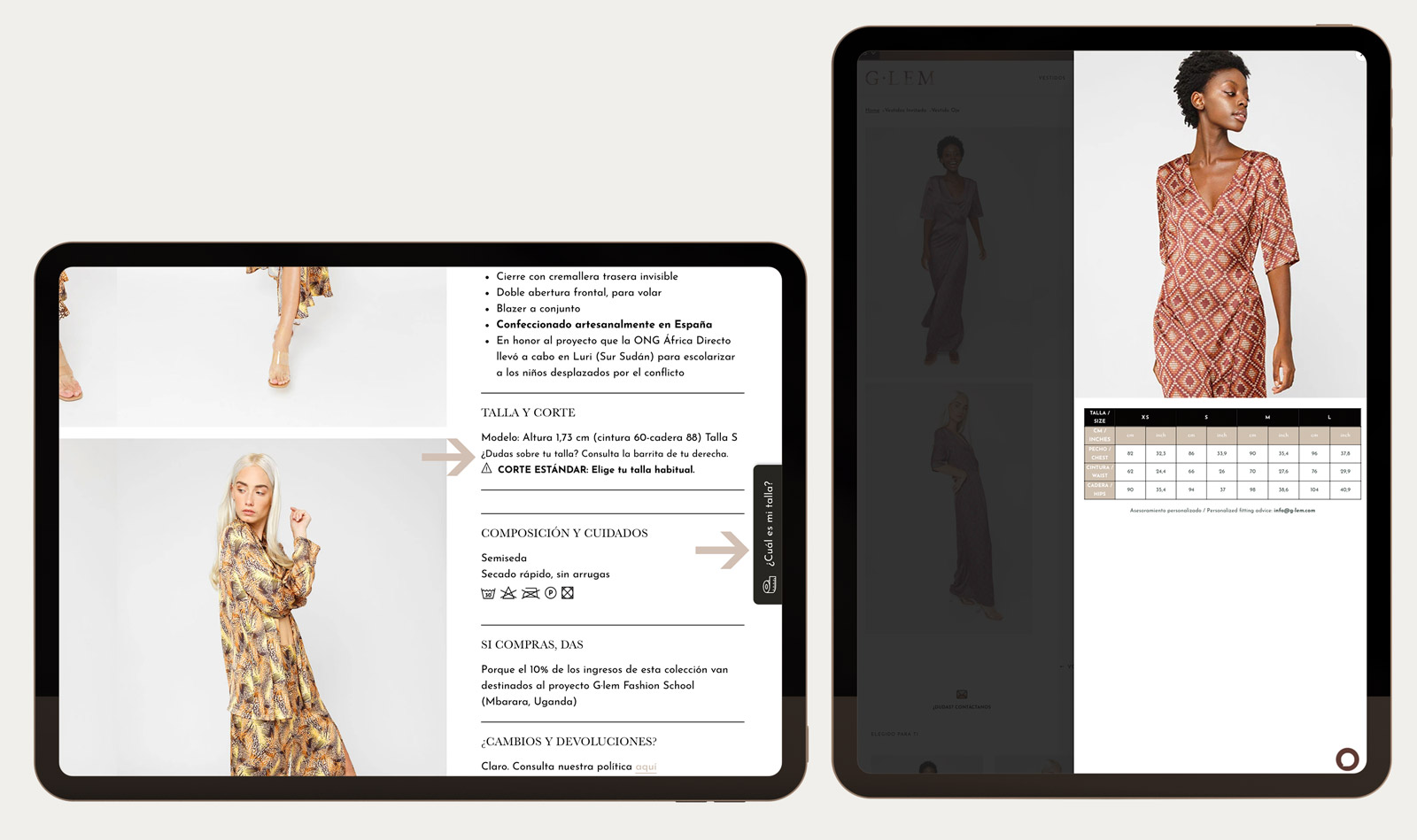
Through heat maps, it was possible to detect that there was a hot spot in the Sizes section, despite the absence of any button, which led to the need to include one in this area. Thanks to the comments in the chat and the questions that are made in the return form, we knew that confusion with the sizes was one of the main reasons for returns.
Likewise, another hot spot was appreciated at the bottom of the page where the navigation to main product category is.
OBJECTIVES
– Include a size guide
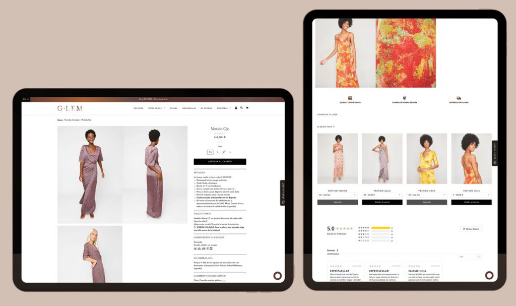
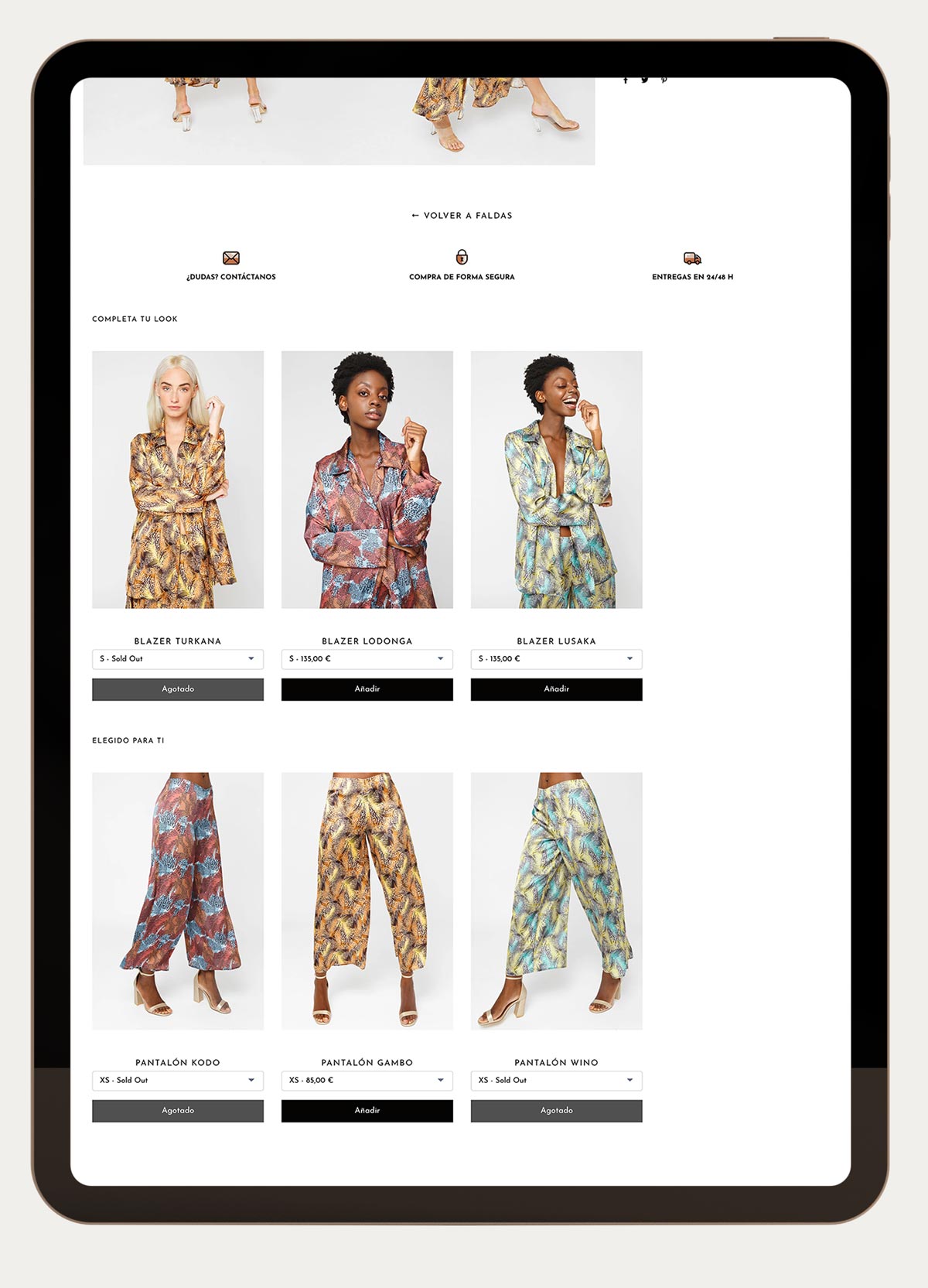
– Take advantage of the bottom of the page to introduce new cross selling sections and related products.
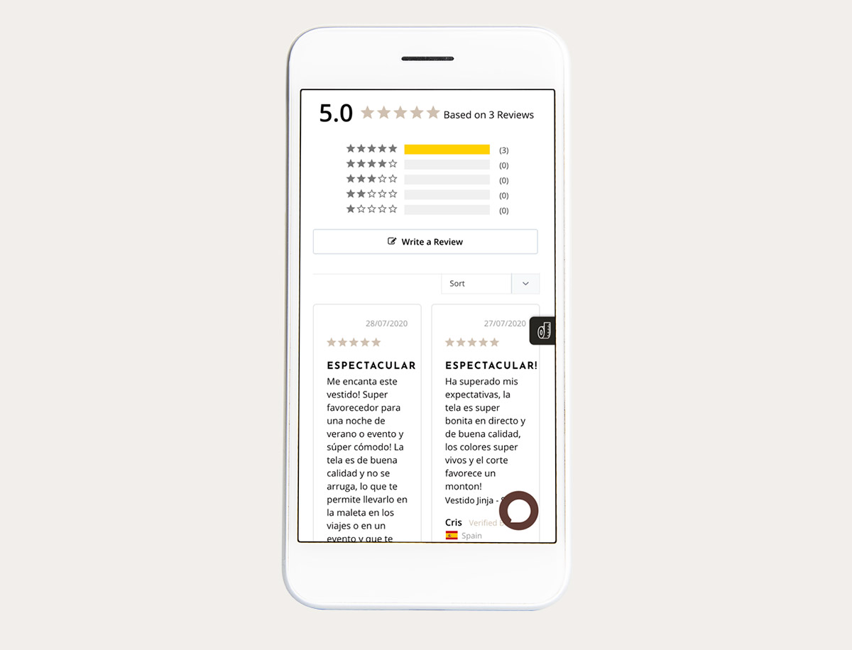
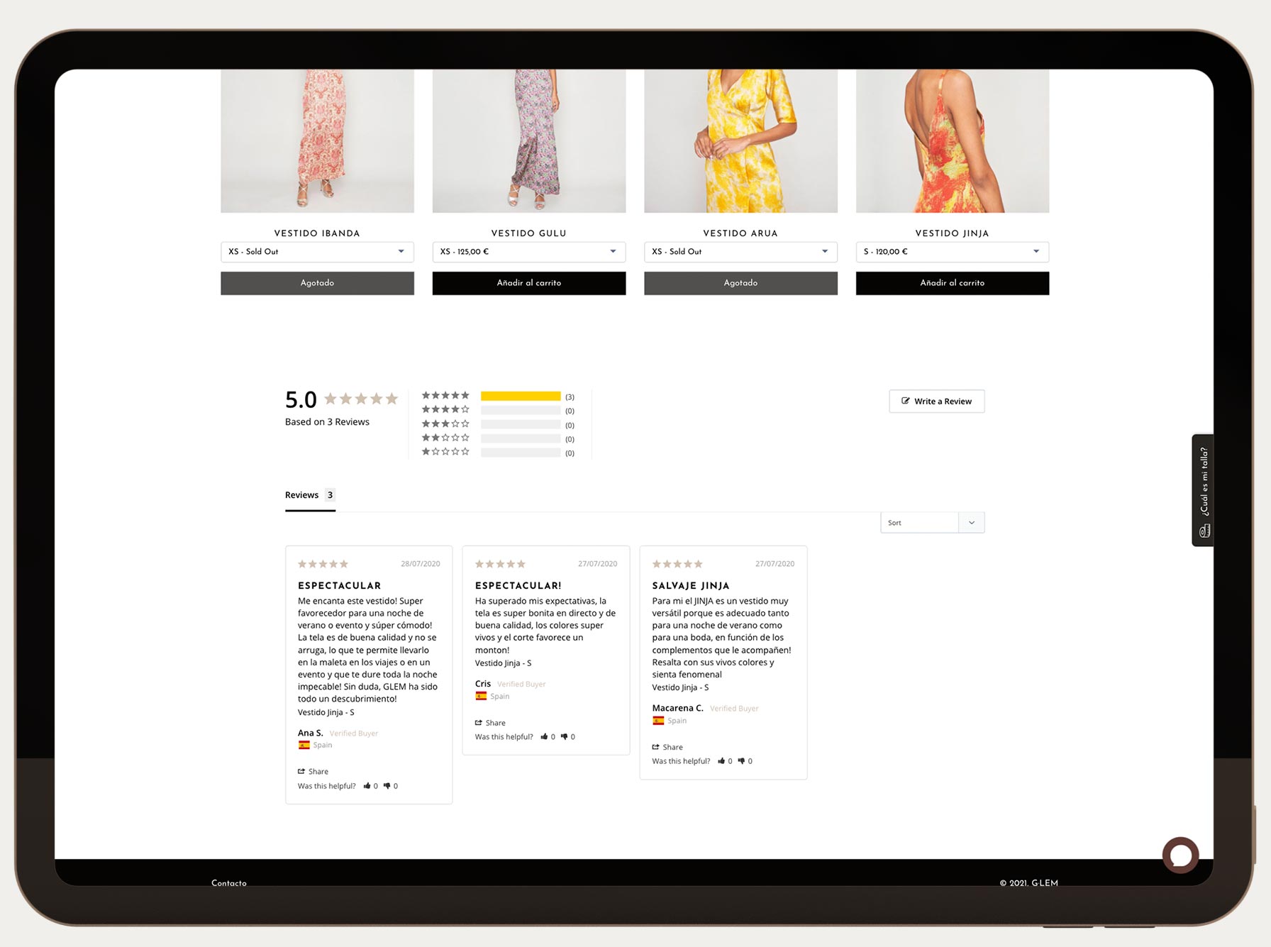
– Introduce a reviews section as an SEO improvement
DESIGN DECISIONS (High fidelity design below)
When trying to introduce several new elements at the same time, one of the most complicated decisions was how to make them not compete with each other and the design was not affected.
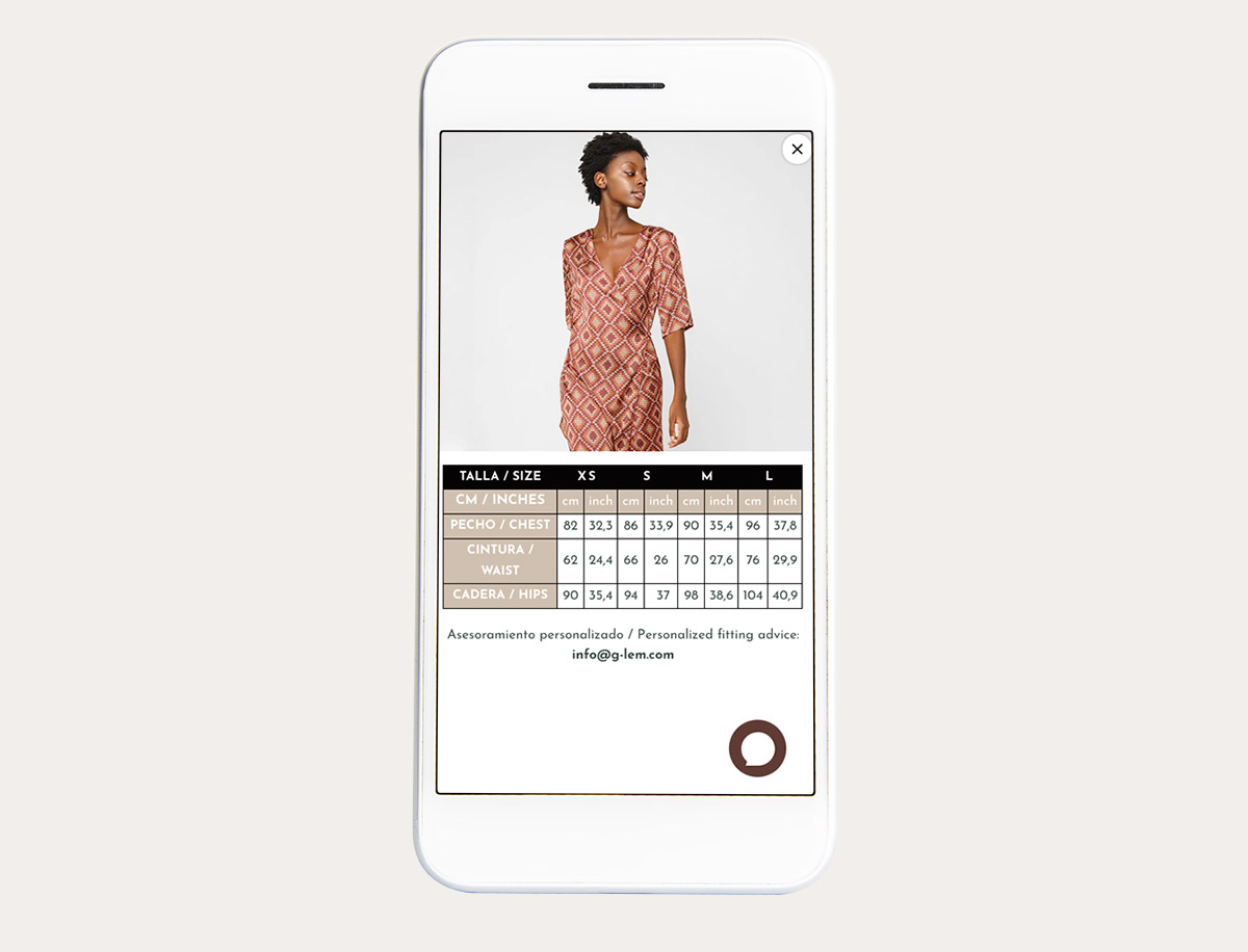
The size guide was the easiest thing to solve, obviously having to go into the Sizes section. However, it was used to design this section as always visible to reduce the doubt in the users. In this way, by using a button like a tab, this information is always available while not being annoying. It is perfectly integrated into the design.
The lower part was left for cross selling and reviews from real customers. The order of these two new elements was chosen based on their importance in order to increase the average ticket. For this reason, the products came first since the reviews were also present in another part of the page as will be detailed later.
At the bottom it was decided to develop two options to highlight and give visibility to more products. On the one hand, it was decided to first promote cross-selling products in order to increase the purchase receipt. Secondly, related products are shown so that in case if the visited product is not chosen, show more products that may be of interest to you.
The reviews were placed at the bottom of the page since under the product name there is an anchor to this section. Various e-commerce studies confirm that reviews are an element that helps boost sales by reducing the margin of doubt and increasing consumer confidence. Likewise, to Google and SEO they are an element that helps increase the natural ranking of the page.
The new product file has managed to increase the sale of related products by increasing the average ticket and reducing returns related to size.