
Rosa Clará Redesing home
MY ROLE
Thanks to analysis and conclusions drawn on Hotjar, the home page scroll is known to cool down as it scrolls to the bottom. There were two large images from Bride and Party categories that were not known to be featured product carousels or links to their categories. Likewise, the Store Locator competed with the Book Appointment link and it was a difficult hierarchical read to follow. In the same way, the main section, which is Bride, did not highlight enough, as well as some very specific landings that existed and that were difficult to access by natural navigation (search a wedding dress by style).
Also thanks to extensive research of the latest trends in bridal website design, as well as social media posts that generate a lot of engagement with the brand, I launched the Real Brides project on the web. In this first step to test the feasibility of the project, only pictures published went directly to the original Instagram post.
BACKGROUND
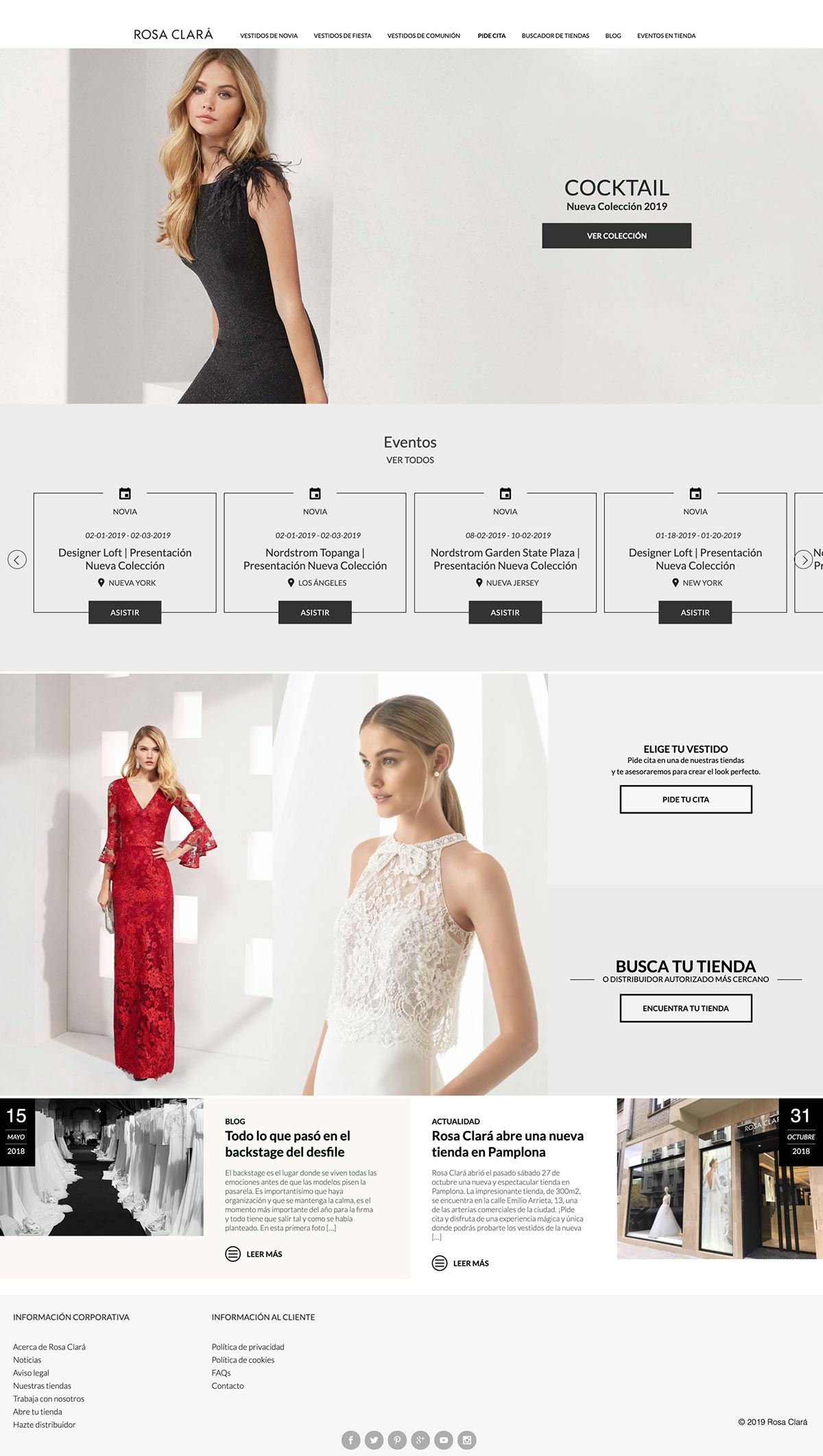
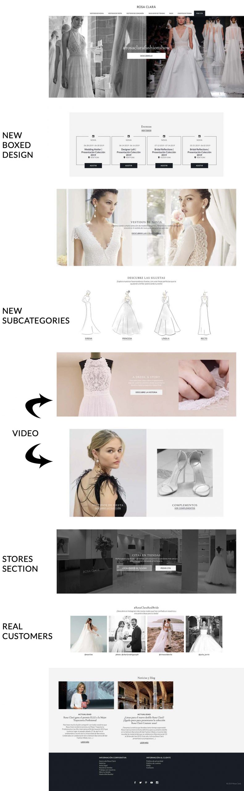
Rosa Clará’s home presented a too classic and compact design where it was difficult to understand the hierarchy and importance of the different categories. It was a block design, without white spaces, with sections with carousels that were not even known to exist, without CTA’s, typography that made the image hard and all designed full-width.
THE PROCESS
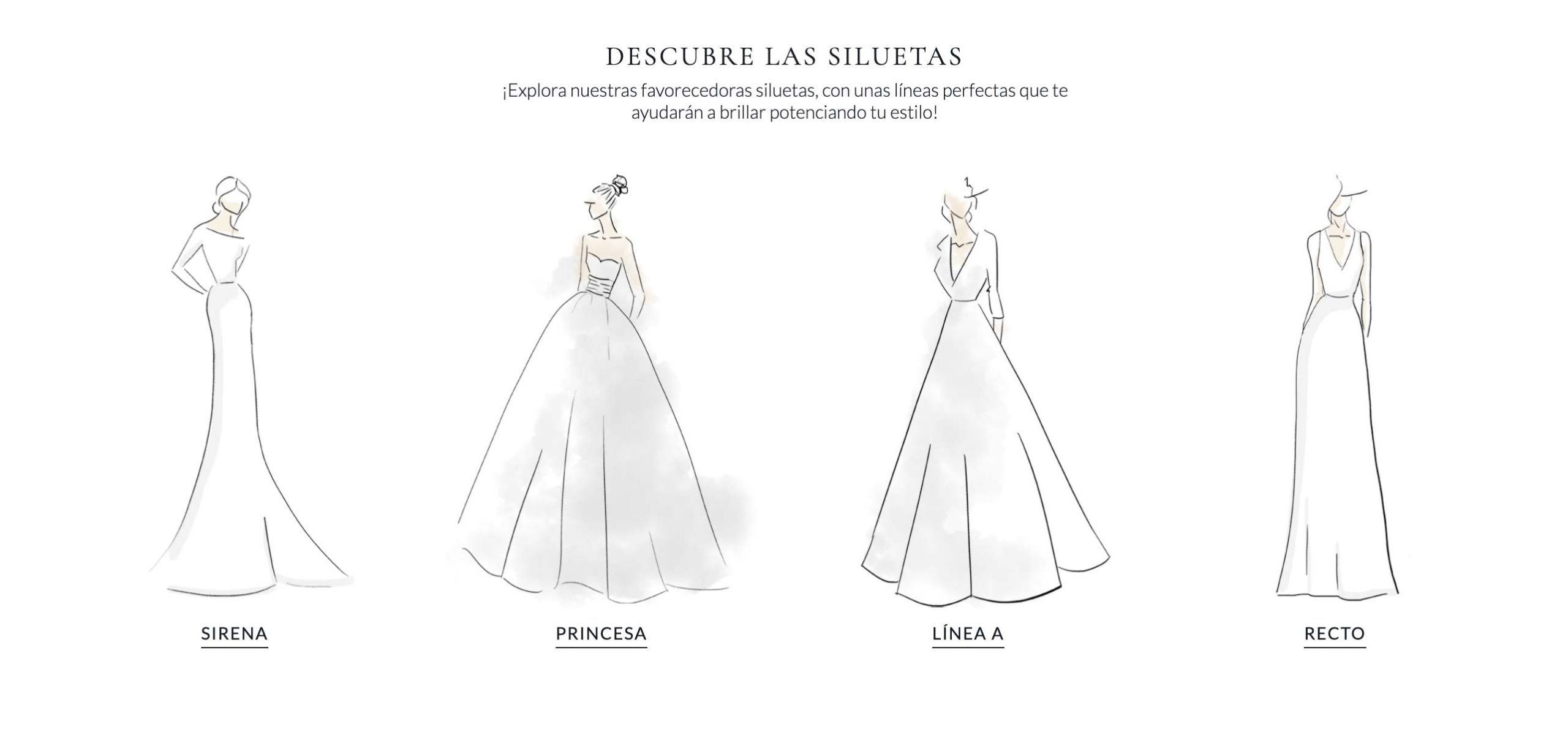
New needs, new categories, new sections!
More and more brides know what they are looking for. The Rosa Clará website does not have filters or a powerful search engine that facilitates this search by the user. It was the reason why it had been decided to make a series of filtering landings that would facilitate this mission based on KPIs and the work of SEO specialists. With the old menu that was very static and with hardly any levels of depth, access to these landings was very difficult. That is why it was decided to highlight these subcategories on the home page at the same time that the main category Bride acquired greater visual weight and also greater importance.
In the home there was no video elements which made the whole page very static. There are studies that show that in webs the use of videos increases the percentage of sales, since the product is seen in real, how it feels and without seeing it as retouched as in the images.
In social media there was a section of Real brides that obtained great engagement and great participation from users. After a great analysis of the competition, it was concluded that more than 90% of the bridal brands use this content on their websites to a greater or lesser extent. As a test for this initial phase, the project was approached only with direct links to its original Instagram posts. In this way it served to test the project, as well as to give greater visibility to the Instagram profile.
Build the categories hierarchy
The categories by number of visits and sales are Bride and then Cocktail. This was what determined its positioning and its visual volume in the new grid. The accessories, previously non-existent on the home page, have a presence together with Cocktail to activate cross selling.
It was also decided to place greater emphasis on the Stores section, in order to promote the search for them and, of course, the request for appointments. Instead of having two sections as before, it was decided to integrate both in the same section, highlighting more the Request appointment since it is the direct transaction.
Prototype
Prototyping is a fundamental part of the interaction process. I started with a simple mockup, with minimal details, to analyze the functionality and the new grid composition on both desktop and mobile.
In this first version of the process, it can be seen that there are practically only gray blocks to analyze the visual weight of each section. Introduction of headlines both within the image and section dividers with explanatory texts were introduced as new design improvement. A new typeface was also tested already at this stage to analyze its readability.
-
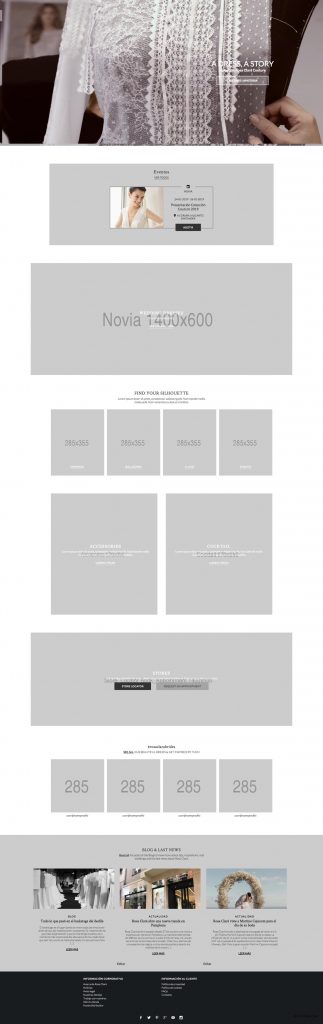
- Initial mockup for desktop
-

- Initial mockup for mobile
The next step was the coordination with the designers, who provided the rest of the necessary visual elements such as videos, images and also a new color guide according to the look & feel of the brand.
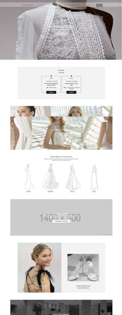
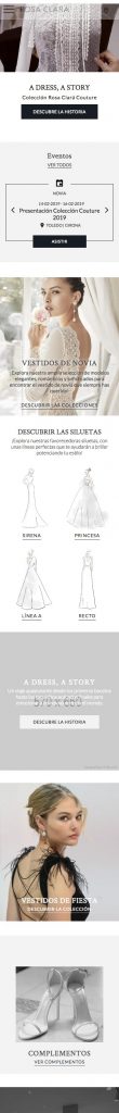
Visual design
During the redesign process, the designers opted to introduce such iconic elements of the fashion world as sketches. In this way, not only the visual monotony was broken, but the artisan character that the brand leads was also highlighted.
The final result
The final result can be seen on Rosa Clara’s website where a new harmony is appreciated, a cleaner design and not so blocky, with sections more boxed than others, not only to break the grid, but also to highlight in this way the greater or minor importance of some sections.
NEXT STEPS
One of the main weaknesses of Rosa Clará continues to be the lack of a modern search engine that facilitates the search. Fortunately, the menu has had great improvements, allowing greater levels of depth and access to new subcategories is much faster and more accessible.
Thanks to these new changes, the heat map showed that the temperate zones were greatly increased and the hot ones increased. The cold areas have been limited to the blog and the footer. As an improvement, it would be necessary to decide whether to enhance the blog (currently it is not a priority point of the company) and if so, see how to make it stop being a cold area.